• For our 10th anniversary on May 9th, 2024, we will be giving out 15 GB of free, off-shore, DMCA-resistant file storage per user, and very possibly, public video hosting! For more details, check a look at our roadmap here.

    Welcome to the edge of the civilized internet! All our official content can be found here. If you have any questions, try our FAQ here or see our video on why this site exists at all!

Facing Worlds #1

Status
Not open for further replies.

Arnox

Master
Staff member
Founder
Messages
5,313
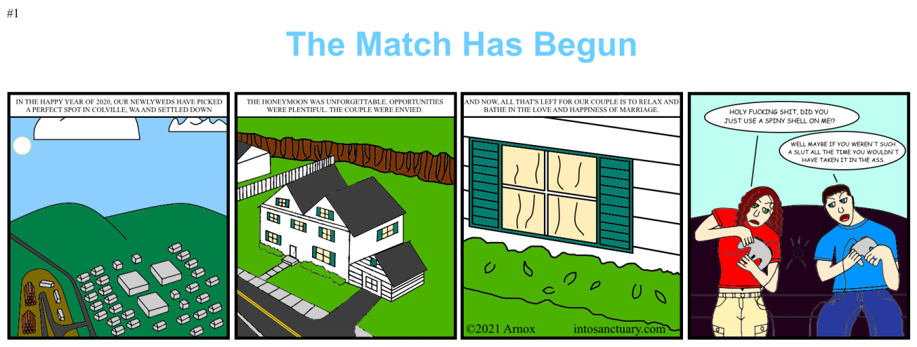
The comic is now FINALLY out. Son of a bitch...

Normally, I plan to release and show all the comics through the XF Media Gallery, but that's not set up yet and this is has been delayed long enough, so this will be the first and last comic to be shown through the forum.


-

Art wise, I'm pretty disappointed in this first comic. Most notably the last panel. Learned a lot, but it was too late and it was time to get this damn thing out the door.

General Graff said:
You don't go when you're ready. You go when you're ready enough.
 
Last edited:

Arnox

Master
Staff member
Founder
Messages
5,313
Me too.
But good job.
I definitely think the big thing here was that I was drawing in too low res and with too thick lines. Makes it look pretty amateurish and it's pretty hard to get details right when you're that "zoomed out".
 

Battousai

Brother Sharp
Sanctuary legend
Sanctuary contributor
Messages
563
Occupation
Cookmaster supreme
I agree with the last panel, the hands are in some really weird poses, but then again drawing hands and feet is hard enough. Even the old artistic masters had trouble with those kinds of things.
 

Drathnoxis

Devotee
Messages
231
I think the real problem is that it isn't amateurish enough!
Take a look at some of this work for some inspiration. Particularly this. It's okay to be bad, as long as people can't be entirely sure if you are doing it ironically or not.
 

bluegate

Disciple
Sanctuary legend
Messages
292
Change the font and font size on those captions, it's borderline unreadable.

Although the spirit of the joke of the entire comic is alright, the lines in the last cell are cringeworthy.

Having said that, the quality of the lines is on par with that of the art, so there's some thematic link there.
 
Last edited:

Vendor-Lazarus

Arch Disciple
Sanctuary legend
Messages
947
Looks adequate, reads fine.
But those hands..yeah.
For a first comic, 3/5
 

Arnox

Master
Staff member
Founder
Messages
5,313
I agree with the last panel, the hands are in some really weird poses, but then again drawing hands and feet is hard enough. Even the old artistic masters had trouble with those kinds of things.
This will be improved in the future. Along with a lot of other things.

I think the real problem is that it isn't amateurish enough!
Take a look at some of this work for some inspiration. Particularly this. It's okay to be bad, as long as people can't be entirely sure if you are doing it ironically or not.
The target art quality is Erin Dies Alone/Critical Miss, so unfortunately, a cartoonish artstyle isn't going to be something that's available to me, even if it would definitely work out better with my skill level.

Use cubeupload. Imgur compresses the images.
Nah, it's not Imgur. I compressed it myself to 75% of the original 1740x660. Yes, I know even the original is really low res. I've learned my damn lesson. lol Expect most likely triple the res for future comics.
 

Houseman

Zealot
Sanctuary legend
Messages
1,074
In six years when your art has improved and you look back on this comic, you can redraw it and make some kind of joke about how "remember when we had that gas leak and we used to hold our controllers like retards?"
 

Arnox

Master
Staff member
Founder
Messages
5,313
In six years when your art has improved and you look back on this comic, you can redraw it and make some kind of joke about how "remember when we had that gas leak and we used to hold our controllers like retards?"
I'll do a special limited platinum collector's edition of it.
 
Status
Not open for further replies.
Top